Works
omotesando-101 Achievements of partner designer
Customer's request
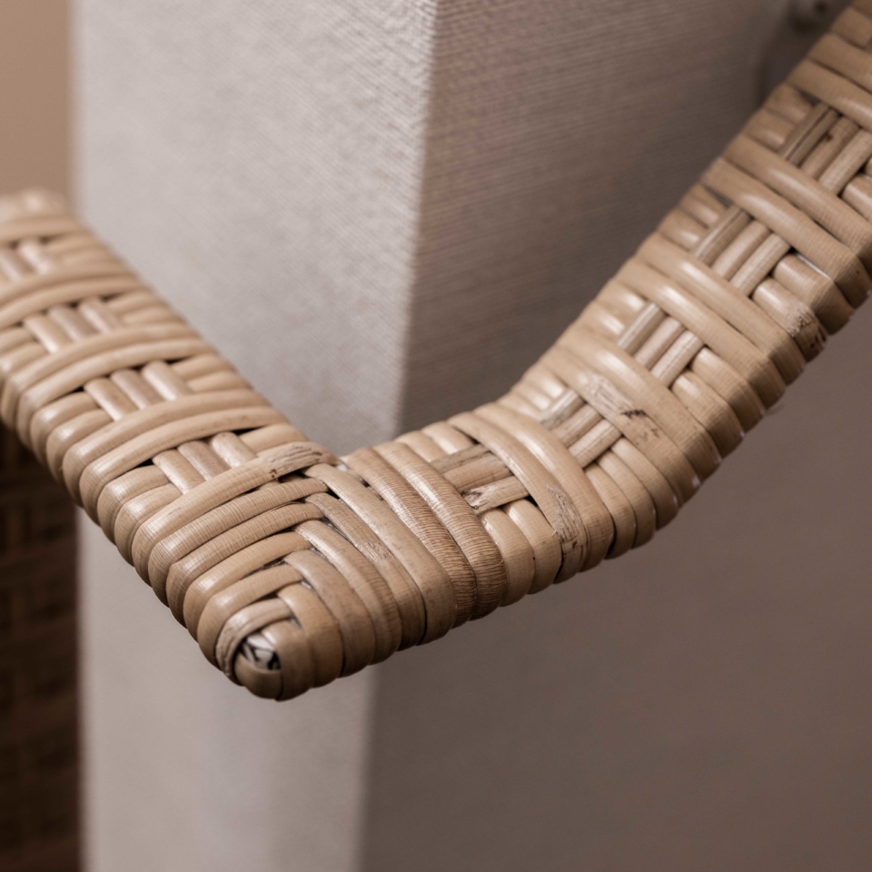
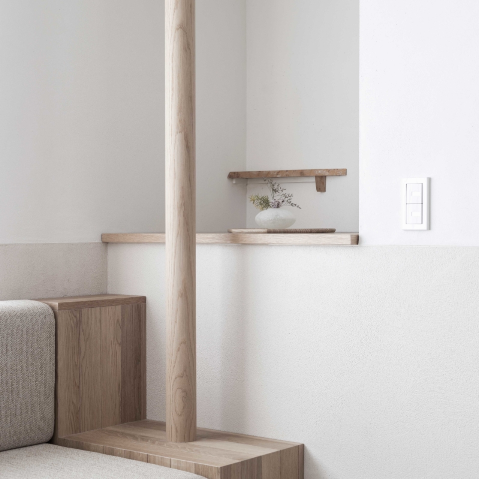
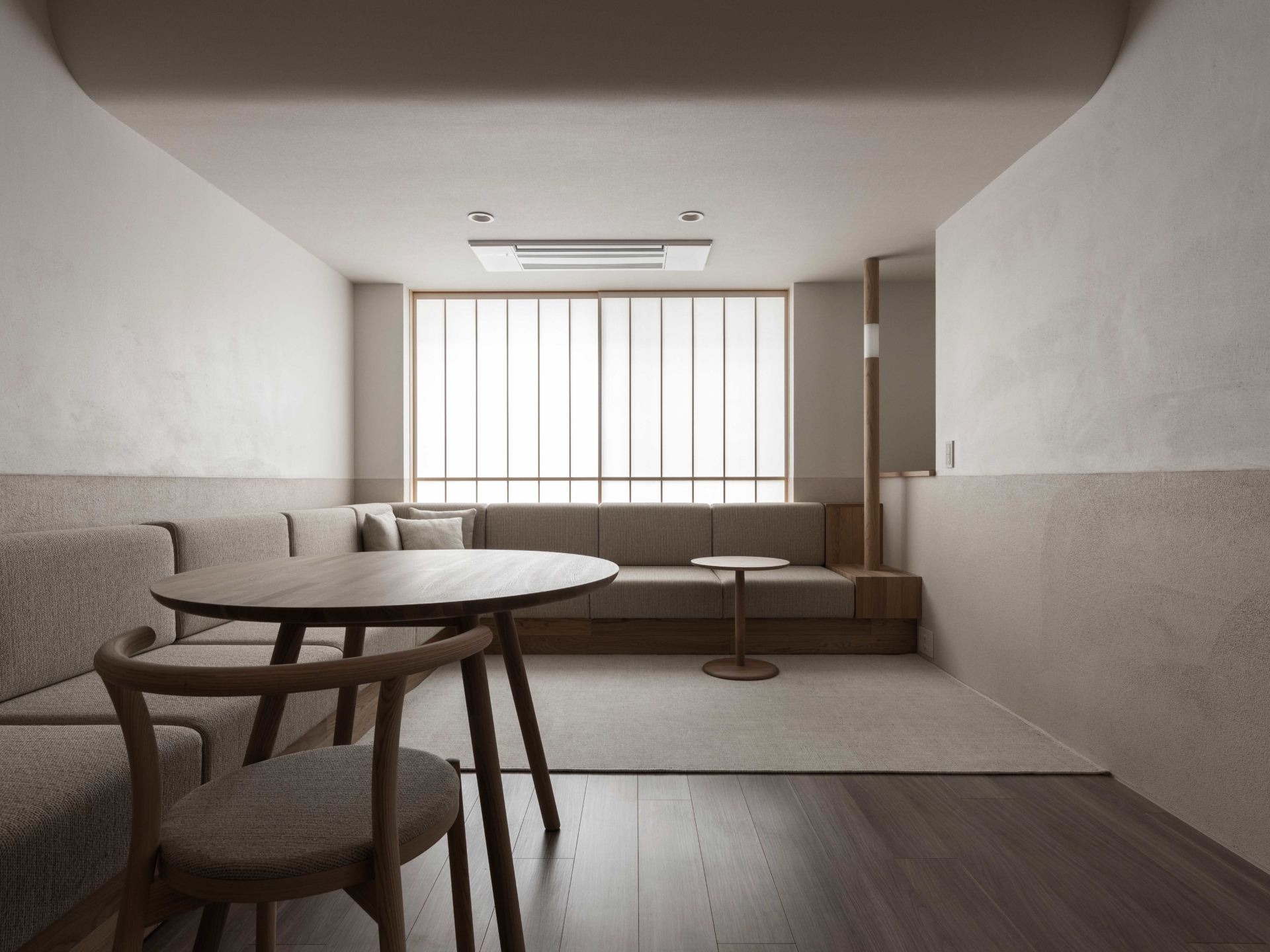
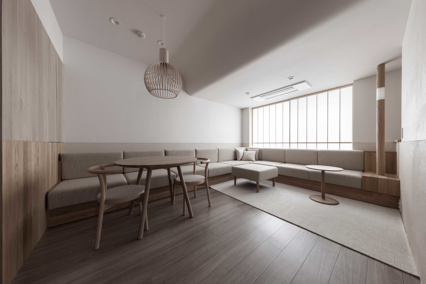
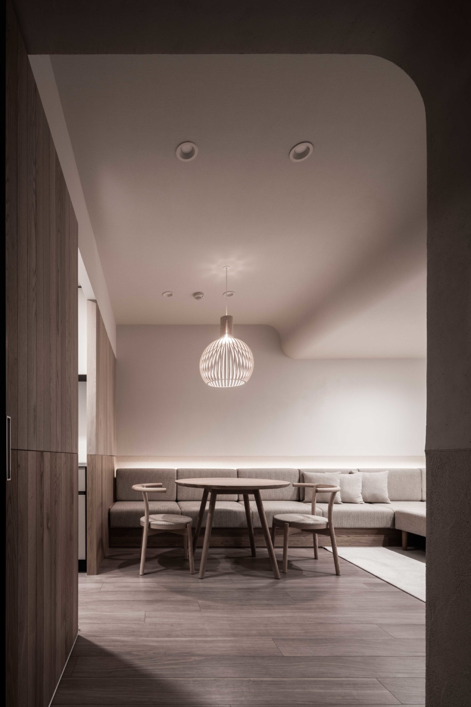
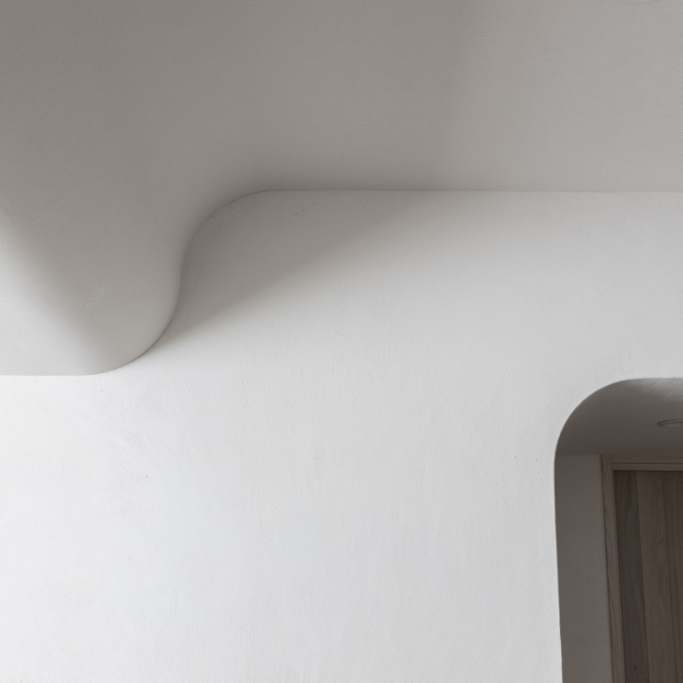
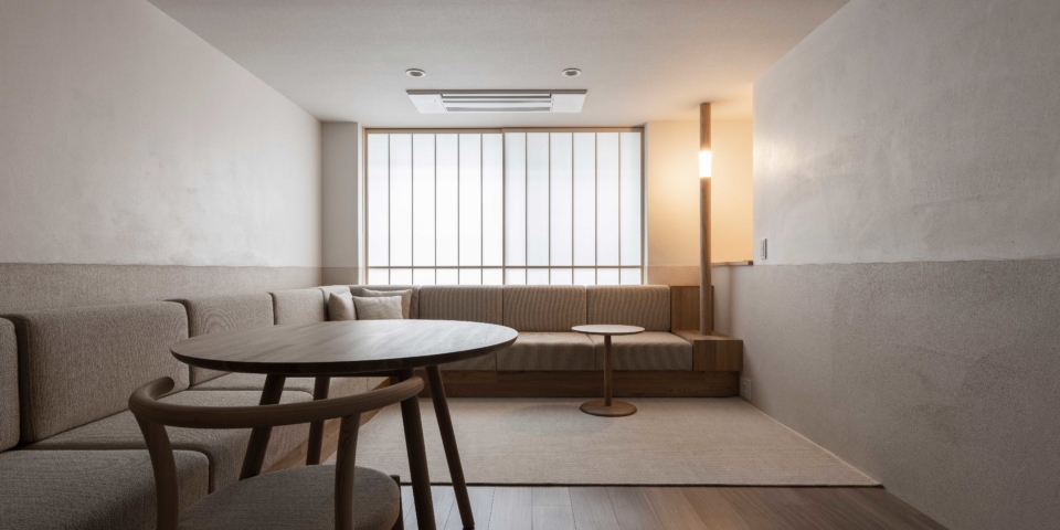
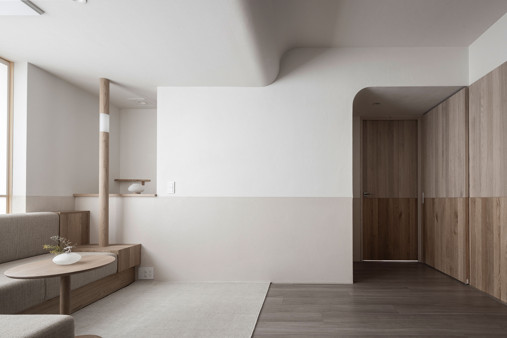
This property has three layout-related issues that we have attempted to resolve in the following manners through renovation work. 1. The existence of a beam that splits the upper portion of the living/dining room into two We designated the space in front of the beam as one with heavy foot traffic and the space at the back facing the windows as a place for relaxing. This allows the space at the back which is mainly for sitting down to have a lower ceiling only as high as the bottom edge of the beam, creating a ceiling height comfortable for people who are sitting down while concealing the unsightly beam. In addition, we delicately connected the two ceilings of different heights to create a structure that naturally guides one’s attention to the windows. 2. Unsightly window grating There was a black aluminum grating outside the windows of this living/dining room facing the ground floor for security reasons. We installed a screen with Japanese “washi” paper to conceal the grating while allowing natural light to filter through and protecting the privacy of the owners. 3. Narrow living/dining room We have arranged a series of L-shaped sofas here to serve as sofas for the living room as well as dining chairs. By incorporating the simple element of an L-shaped sofa, we were able to make the entire space feel more spacious and expand the range of its possible functions. Regarding the choice of materials and the overall composition, we used translucent Japanese “washi” paper for places that benefit from natural light filtering through, wood and rattan for fixtures that come into contact with human hands, and construction materials such as plaster and diatom earth for walls. As much as possible, we selected the appropriate materials for each site from the natural materials available. Next, we used horizontal lines to segregate the space into zones so as to ensure that the different components co-exist with one another in the same space. These horizontal lines were also used because they give the space a feeling of spaciousness through an emphasis on unity and perspective within the space. The horizontal lines closer to the body were given more intense colors and pronounced textures so that they feel more intimate to people. Conversely, the upper sections have milder colors and textures so that they feel less imposing and more expansive. After we have set up the space based on our model, we threw off the overall balance of the space ever so slightly by incorporating pillars and alcoves. In doing this, we hope to call to mind the Japanese aesthetic principle of discovering beauty in imperfect objects.
- Construction area
- Tokyo,Japan
